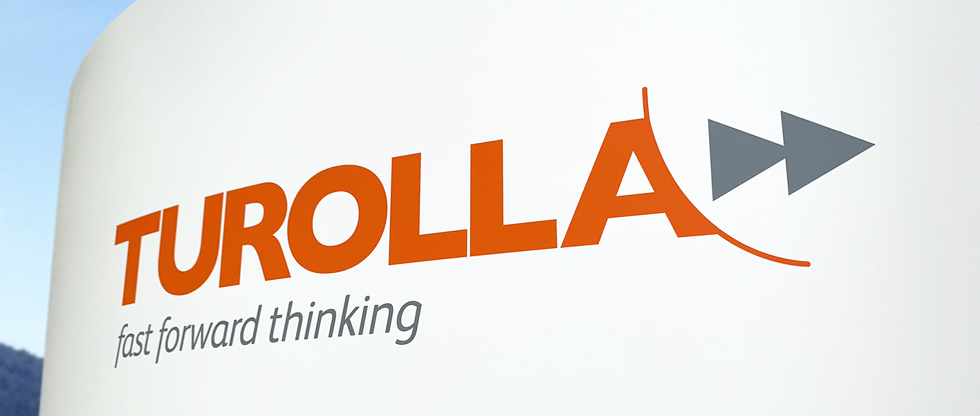
As a member of the global Danfoss Group, Turolla engineer, manufacture and supply Gear Products and Fan Drive Systems.
The challenge was big and clear; reinvigorate an old tired brand that served its time and deserves to be brighter brand for a brighter future.

TUROLLA
fast forward together.
The Challenge
The Solution
For many years Turolla had exclusively used blue within its communications, reinforcing perceptions of it being too cold and corporate. In our redesign we expressed the brand through the energy of orange, allowing the brand to communicate to its audiences their innovative products and solutions.
At launch, the vivid contrast between the old and the new was exciting and dramatic, serving as an instant and powerful signal for change—from old to young, and from corporate to personal.
With a new, vibrant expression, Turolla made a visible commitment to connecting with its customers.
‘Fast Forward Thinking’ was created to ignite storytelling which in turn built stronger emotional connections with customers and the product and service innovations being developed and launched.
Clarity delivered for Turolla
Research and Interviews / Naming Exercise / Workshops / Brand Strategy / Visual Styling Logo Development / Visual Identity / Tone of Voice / Identity Guidelines
Literature / Purpose / Values / Principles / Promise / Story / Strapline / Public Statement / Internal Branding
Literature / Purpose / Values / Principles / Promise / Story / Strapline / Public Statement / Internal Branding
“Clarity continues to bring the value and creativity we respect at Turolla, and has certainly moved us forward – fast!”
Massimo Dovesi I Global Sales & Marketing Director
